Polly Fern is a freelance illustrator, ceramicist and whippet owner, based on the Norfolk / Suffolk border.
Illustrating and translating her work into one-of-a-kind romantic vases, platters and plates. Each earthenware piece is designed, handmade and fired by Polly. Inspired and informed by traditional ceramic shapes, but slab built to create a modern take on a traditional vessel. They are dipped in a tin glaze, with each one painted upon using oxides and pigments. These paintings make each piece an original work of art.
Polly's work has been displayed in various galleries around the world, such as The MET Museum in New York, The Sainsbury Centre in Norwich, Tonkachi in Japan, The New Craftsmen, and Pentreath & Hall in London. Polly continually works on design and illustration collaborations and collections.
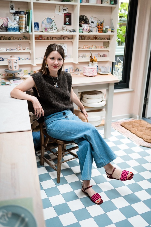
Polly Fern in her studio
Here, Polly has worked with us picking her top lots from the Frank Hermann Collection, one of the most significant compilations of dinner, tea and dessert services to have come to auction in recent years.
She says: “I am always looking back in time for inspiration for my collections. Whether this be for the decoration techniques, colour palettes or historical references of the time. I find pieces that tell stories of particular interest, whether this be a Victorian child’s plate, delftware tile, or a salt-glazed bellarmine jar; the world of ceramics is vast. I draw inspiration from many different periods throughout the history of ceramics, but I like to put a modern take on my pieces. The different styles and techniques tend to eclectically merge as what I like to call my Romantic Vases and Platters.”
And here are Polly's picks:
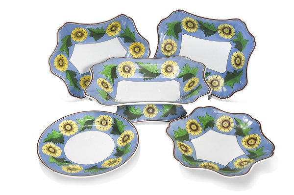
Lot 463 - A Wedgwood creamware, pattern 1204 dessert service, circa 1810
“This era of decoration at Wedgwood is one of my favourites, and one that particularly influences the way I decorate my own ceramics. The craftsmanship of these dessert service shapes is exquisite. The enamel-painted decoration is very confident and not overly detailed, which works wonderfully with the subtle but decorative form.
The flat opaque blue ground and minimal colour palette make for quite a graphic design, which would have stood out at the time. This balance of the decorative form with a more graphic decoration is perfect and timeless. The brown banding on the rim really completes this set and sets off the Wedgwood blue beautifully.”
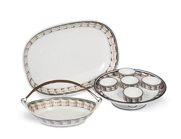
Lot 465 - A creamware egg cup stand for five egg cups, circa 1790 – 1800
“Simplicity is key with this particular design. The design may look simple, but the painting of this decoration would have been very precise and accurate to achieve such a striking faux ribbon band. I particularly love the subtle shading which transforms the ribbon to achieve the trompe de l’oeil effect. The pared-back palette of iron red, grey and black helps to enhance the design. I like the idea of the ribbons decorating and encasing the food, which works particularly well with the egg cups!”
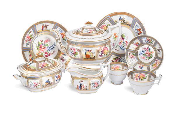
Lot 414 - A New Hall tea and coffee service, circa 1820 – 25
“Within my own ceramics, I am always trying to figure out new ways of storytelling. This New Hall tea service is a great example of how you can encase decoration to create a sequential narrative. These pieces are dated from 1820 - 25, with scenes of peasants undergoing everyday pursuits. They have been painted in a very charming manner with subtle landscape washes. The golden gilt encasing the naively painted people next to the decorative florals creates a wonderful juxtaposition that makes these pieces very appealing and sets them apart from solely floral-painted wares.”
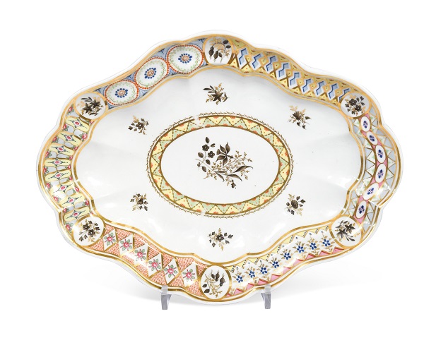
Lot 410 - A Chamberlain Worcester dessert dish, circa 1796
“This exquisitely decorated Chamberlain Worcester dish jumped out at me when I was looking through the catalogue. What sets it apart from the others is the unusual variation of decoration running around the border. This very playful harlequin design reminds me of a sophisticated sampler plate - which is absolutely charming. The colours, alongside the gold gilt and sepia floral sprigs, are really well balanced.”
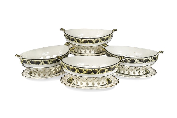
Lot 466 - A set of four creamware chestnut baskets and stands, circa 1795
“For me, this has to be one of the stand-out sets in the collection. I usually adore creamware chestnut baskets for their simplicity, but this oak leaf and acorn design is wonderful. The yellow coloured ground with black painting complements the creamware. This is a perfect example of where a simple design works best, relying on and letting the shape of a paintbrush do the work, to create a simple repeat pattern with subtle shade/depth of colour between the leaves and acorns.
The oval, bulbous shape of these baskets is superbly formed, and how wonderful and rare that there is an intact set of four! The finishing touch of the harlequin-painted handles makes these classic pieces feel very unique.”
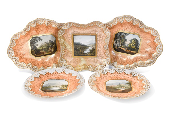
Lot 405 - A part Chamberlain Worcester dessert service, circa 1815
“Creating sentiment within ceramic design is something that I find particularly important in getting people to interact with pieces; and is what I find fascinating about this Chamberlains Worcester dessert service. The way that these familiar picturesque scenes and landscapes can give people a personal connection to the ceramic, reminding them of a place once visited that is dear to them.
These dramatic and pastoral scenes are encased in grand and unmistakable salmon and gilt decoration. I love the idea of these ceramics as being a travel guide to the United Kingdom, with the scenes an insight into the history of the British landscape, acting as historical markers in ceramic form.
The painters of these Worcester collections were incredibly talented at executing these intricate miniatures. I find the colours they achieved particularly impressive, as a firing alters and changes the final colours, and to learn and be able to achieve the depth of palette as featured on these plates takes a trained eye and a great depth of craftsmanship.”
To view the catalogue for The Fine Sale, please click here to find out more about Polly Fern, please click here